Brand guidelines
This guide provides the foundation from which to create TC Energy branded materials. It is intended to ensure that our brand shows up in a cohesive way, but also offers professional designers the flexibility to use their discretion to continue to find new and engaging ways of using brand elements to tell our story.
Our Voice
Our voice is shaped by the words we choose and the way we express them across all content and contexts. The language we use, along with the tone we apply, works together to build a consistent and compelling TC Energy brand voice.
Our voice is confident, approachable and optimistic.
Confident: We speak with clarity and conviction. We understand the complexity of the energy landscape and communicate with purpose. Our tone is assured—not arrogant—grounded in expertise and a commitment to progress.
Approachable: Our work can be complex and technical, but we should always strive for a conversational tone. We never want to intimidate or create confusion with insider jargon.
When TC Energy speaks, it must be crisp, clear and able to create a comfortable dialogue with anyone.
Optimistic: We believe in possibility. Every challenge is an opportunity to innovate, collaborate and lead. Our optimism is rooted in action and in the belief that what we do today shapes a better tomorrow.
Use case examples
Ad copy 1
Every day, our dedicated team proudly connects the world to the energy it needs, moving over 30 per cent of the natural gas used across the continent and driving LNG exports to global markets.
Because nearly everything the world wants to achieve tomorrow demands a ready and secure supply of energy today.
Ad copy 2
We are North America’s leading energy infrastructure company, home to the only network that links Canada, the U.S. and Mexico.
We create pathways to deliver abundant, secure and reliable energy to a world that increasingly depends on it.
Logos
Although by itself our logo is not a brand, it is an at-a-glance snapshot designed to trigger recognition of who TC Energy is and what we represent. Part of any logo’s strength and effectiveness comes from its consistent repetition.
Download logosBrand logo
Full logo. This version should be used in most instances to ensure brand recognition, as long as space permits.

Emblem
Maximizes legibility and recognizability in smaller spaces. It also serves as a visual shortcut to the brand in a modern way to build memory structures to consumers.
Minimum clear space
It is important that the space around the TC Energy logo or emblem is not encroached upon in order to provide breathing room for the logo to stand out.

Emblem component
Using the width of one of the two emblem components will ensure that the safe space is always relative to the size of the logo.
Minimum size
The full logo should always be legible, so it should never be less than the minimum size. If it is not possible to avoid such a small size, use the emblem instead.
Digital
Use the emblem when you are unable to make the width of the full logo at least 150px.
Use the emblem when you are unable to make the width of the full logo at least 1.125in.
Logo colours
Our logo must always be presented in a single colour.
TCE Blue
This is the preference when placing our logo on very light backgrounds.
White
This is the preference when placing our logo on dark backgrounds or photos.
TCE black
Use this for greyscale design or print.
Incorrect usage
Avoid using the logo in these ways.
Do not use our old logo (note the colours)
Do not stretch or skew the logo or emblem
Do not use low-contrast colour combinations
Do not rotate the logo on an angle
Do not outline the logo
Do not change the placement of the emblem
Do not overlap logo elements
Variations
We operate in three countries – Canada, the United States and Mexico, so it is important that we use the most appropriate logo for each audience.
English
The default variation for audiences with an English language preference or when the audience language preference is unknown. Used primarily in the U.S. and the English-speaking parts of Canada.
Spanish
The default variation for audiences with a Spanish language preference. Used primarily in Mexico.
French
The default variation for audiences with a French language preference. Used primarily in French-speaking Canada.
Voir les directives du logo français![]()
Ver las pautas del logotipo en español![]()
Colour
Primary Palette
Blue is a sign of stability and reliability. It also projects an image of security and a sense of orderly professionalism. The vibrancy of TCE Blue gives the brand a touch of modernity and newness that stands out and differentiates itself from the sea of sameness in the category.
TCE blue
R13 G100 B239
PANTONE 285C
C82 M55 Y4 K0
Note: Pantone should be used in all instances where possible
TCE black
R25 G25 B25
PANTONE Process Black C
C73 M67 Y65 K79
White
R255 G255 B255
PANTONE White
C0 M0 Y0 K0
Secondary Palette
Our secondary colour palette is to be used sparingly to enhance and compliment the primary colous used. These colours are particularly useful for background textures and bringing attention to a specific part of the design and should always be used very intentionally.
Turquoise
R63 G207 B213
PANTONE 3115
C61 M0 Y22 K0
Lime
R193 G245 B14
PANTONE 380C
C29 M0 Y100 K0
Dark blue
R0 G35 B102
PANTONE 294C
C100 M93 Y29 K25
light blue
R137 G207 B240
PANTONE 292C
C42 M3 Y1 K0
Tertiary Palette
To be used for digital only with graphs and charts if it is not possible to present data clearly with primary and secondary colours.
Cerulean
R32 G121 B158
Vista blue
R128 G151 B193
Light green
R128 G226 B113
Celestial blue
R38 G153 B226
Mint
R103 G173 B126
Polynesian blue
R25 G74 B140
Weighting
Our primary colours should make up the largest percentage of our branded materials, with other colours used for background elements, accents or calls to action. This does not necessarily mean that every piece of creative needs to follow this weighting, but that collectively, this should be a fairly accurate representation of the weighting of the colours used.

Accessibility Contrast
There must always be sufficient contrast between text and the background it’s placed on. The following combinations pass WCAG 2.0 accessibility standards, so can be considered safe to use.
Typography
Primary Font
An open and inviting typeface family. Its slightly rounded corners have a warm and welcoming feel that’s clean and modern. Terrific for headlines that stand out and body copy that’s highly legible.
Weights: Regular, Semibold and Bold
Praxis Next
AaBbCcDdEeFfGgHhIiJjKkLlMmNnOoPpQqRrSsTtUuVvWwXxYyZz0123456789!#&@$%*(),.
AaBbCcDdEeFfGgHhIiJjKkLlMmNnOoPpQqRrSsTtUuVvWwXxYyZz0123456789!#&@$%*(),.
AaBbCcDdEeFfGgHhIiJjKkLlMmNnOoPpQqRrSsTtUuVvWwXxYyZz0123456789!#&@$%*(),.
Use case examples
Headlines
Energy. Connected.
Body copy
We are a leader in North American energy infrastructure, spanning Canada, the U.S. and Mexico. Every day, our dedicated team proudly connects the world to the energy it needs, moving over 30 per cent of the cleaner-burning natural gas used across the continent.
Secondary Font
A powerful and meticulously crafted typeface Inspired by the aesthetics of robotics and machines. It’s a font suited for the future of technology which is reminiscent of the goals at TCEnergy. Its unique qualities grabs your attention and is a perfect contrast to the open and inviting qualities of Praxis Next.
Weights: Medium, Semibold and Ultrabold (uppercase only!)
PP Neue Machina
ABCDEFGHIJKLMNOPQRSTUVWXYZ0123456789!#&@$%*(),.
ABCDEFGHIJKLMNOPQRSTUVWXYZ0123456789!#&@$%*(),.
Note, there are two versions of PP Neue Machina: Inktrap and Plain. TC Energy uses Plain.
Use case examples
Subhead
Natural gas pipelines
Callouts with underline
Proudly connecting the world to the energy it needs
Stats
25%
Microsoft Font
Rolling out fonts to thousands of machines and servers across our company is both difficult and cost prohibitive. We therefore recommend the closest Windows system font to Praxis Next – Calibri -- for everyday use in applications such as Microsoft Office.
Light, Regular and Bold
Calibri
AaBbCcDdEeFfGgHhIiJjKkLlMmNnOoPpQqRrSsTtUuVvWwXxYyZz0123456789!#&@$%*(),.
AaBbCcDdEeFfGgHhIiJjKkLlMmNnOoPpQqRrSsTtUuVvWwXxYyZz0123456789!#&@$%*(),.
AaBbCcDdEeFfGgHhIiJjKkLlMmNnOoPpQqRrSsTtUuVvWwXxYyZz0123456789!#&@$%*(),.
Use case examples
Headlines
About Build Strong
Body copy
Our social impact program, Build Strong, invests in organizations that are vital to our communities and crucial for our business. Whether we are providing grants, awarding scholarships, or providing in-kind support, our goal is to help build mutually beneficial relationships that address our biggest social challenges, while building strong communities.
Iconography
Icon Style
Born from the brand’s emblem, we want to create a set of icons that are unique to TC Energy. Implementing subtle cues to strengthen brand awareness, we’ll incorporate the same angled cut found in the brand’s emblem into the rings that house the icons. The icons themselves use a basic single line, single colour, hollow icon style with rounded corners.
Emblem cut
We establish a cropping area for our icon’s frame by using the angles between the gaps in the TC Energy Emblem.
Frame
After drawing an outlined circle, we remove two of the areas (top and bottom) that fall into the crop area.
Line thickness
Line thickness of icons should always be consistent. At a size of 100px x 100px, the icon should have a 3px stroke and the frame a 5px stroke. Strokes must then be outlined to ensure that the icons scale up and down while maintaining the same line thickness relative to the icon size.
Sample set
Since it is impossible to account for all content that we would like an icon to represent, we will continue to build this library as new categories or items arise. Use these as a guide when creating new icons.
Natural Gas
Power
Nuclear
Safety
Environment
Government
Indigenous
Finance
Legal
Innovation
Security
Photography
Lifestyle
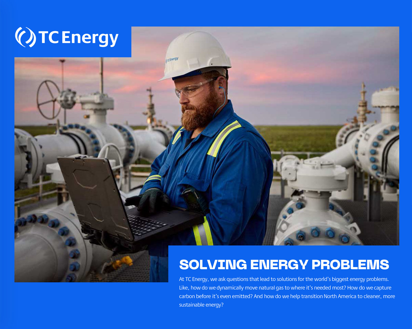
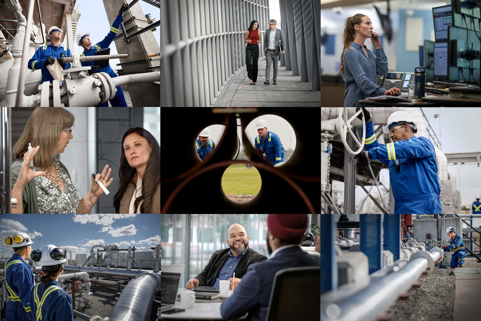
Lifestyle photography should feel determined, emotional and as authentic as possible. Incorporating interesting angles and perspectives while showing depth supports our Energy. Connected. narrative. Overly posed shots should be avoided.
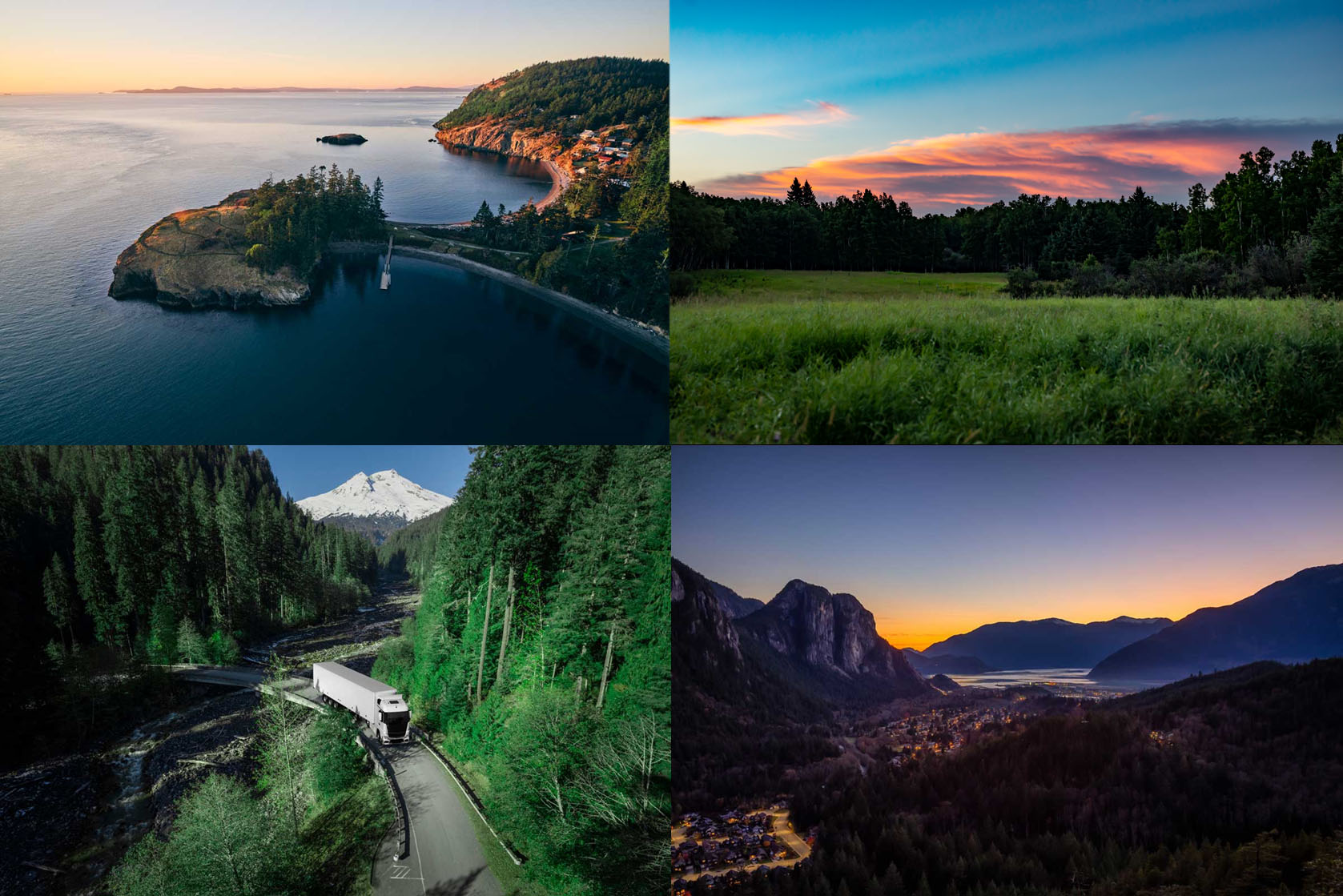
Landscape
Landscape photography should provide a sense of vast scale and depth that represent humans using energy. Taken from unique perspectives and angles. It should be rich and saturated. Avoid tropes such as models looking off into the distance.
Crop
We apply a crop to images that’s truly distinctive for the brand. Giving the brand a technical and sleek look that’s striking and stands out in the category. This must be used intentionally in a way that makes sense for the surrounding content.